RadioTrax Android
Project Description:
We started to work on the redesign of RadioTrax for Android after releasing a new iOS application and a new web-portal.
At this point in time Cognosos had matured as a company and our customer base in the automotive industry was steadily growing.
At the same time, RadioTrax for Android was lagging behind: it lacked core functionalities, had user experience problems, and looked outdated. Moreover, training users on very different applications for the same purpose became a growing concern for our support team.
Therefore, aligning the look and feel of our mobile applications, became Cognosos' strategic goal. Achieving this goal would help us to reduce development and training costs, and to complete the creation of an ecosystem on three platforms.
In addition, our iOS application was already deployed in the field and we were receiving feedback on it via our customer experience specialists. Since I was appointed to design the application and lead it to production, I decided to use this opportunity to optimize the application.
Design Process
Usability Testing
To optimize the functionalities and the user experience of the iOS application, I designed a comprehensive usability test and conducted five user interviews. Based on the test results, I calculated the average success rate and the System Usability Score (SUS), which are presented below:

Average success rate and system usability score (SUS) based on 44 user tasks
The analysis showed that we were doing fine, an insight that was in line with the feedback from the field, but also revealed a range of usability problems. Some of the discovered usability issues (and suggestions how to fix them), are depicted below:
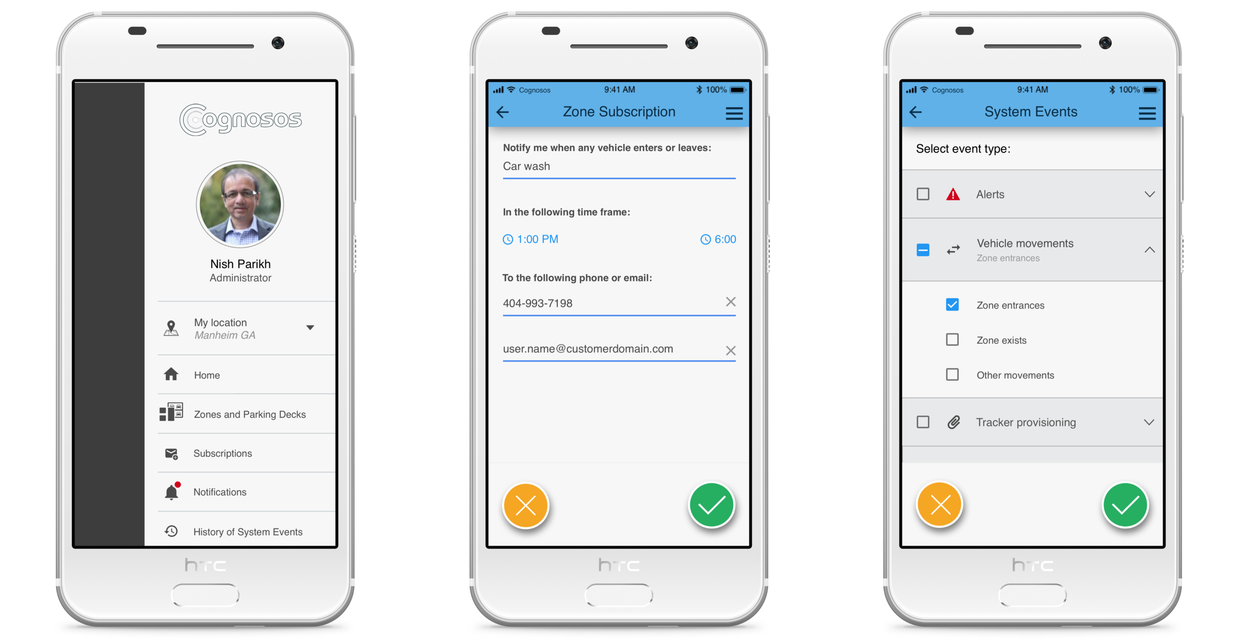
Relocate less used functionalities to the Side Bar :
Inspection of historical system events is done mostly by the Lot Administrator persona only and used rarely on the mobile. Therefore, the Events functionality should be moved to the Side Bar. In addition, users rarely create virtual zones from the mobile application. It’s a system management functionality, and it’s more convenient to do on a big screen. Therefore, Zone Management functionality should be moved out of the mobile application.
Allow tapping on an already selected menu tab:
Initially, we decided not to enable tapping on an already selected tab, and enable navigation within its functionalities using the back button. However, the usability test showed that users expect to be able to tap on an already selected tab and navigate to the highest level of hierarchy within it more quickly.

Insert buttons into menus:
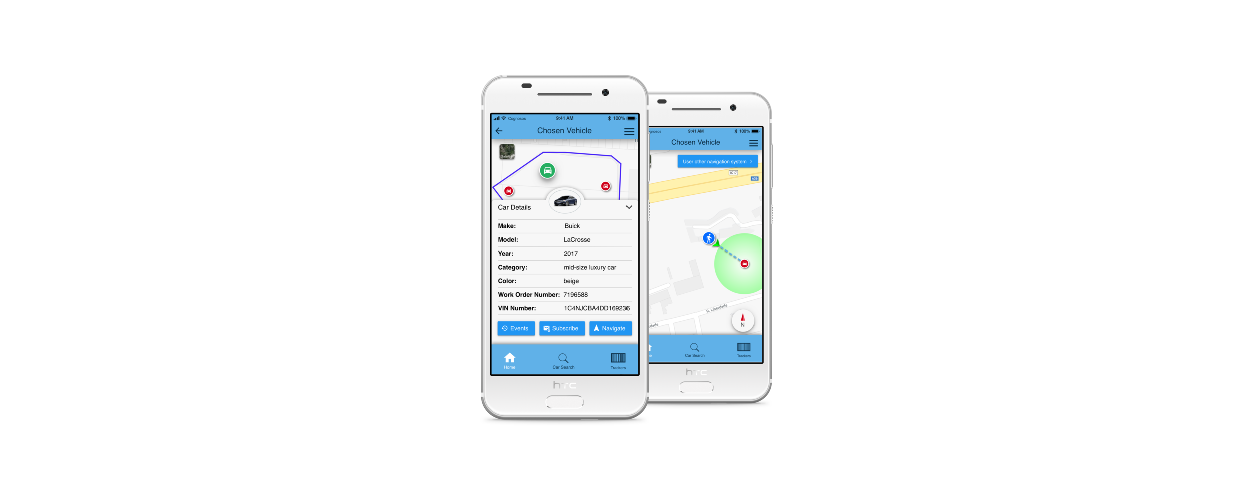
Users expect to see actions, such as subscription to an asset or viewing asset events, inside more visible and familiar elements such as the Slide Bar and the Side Bar. Therefore, the recommendation is to consolidate actions into menus.
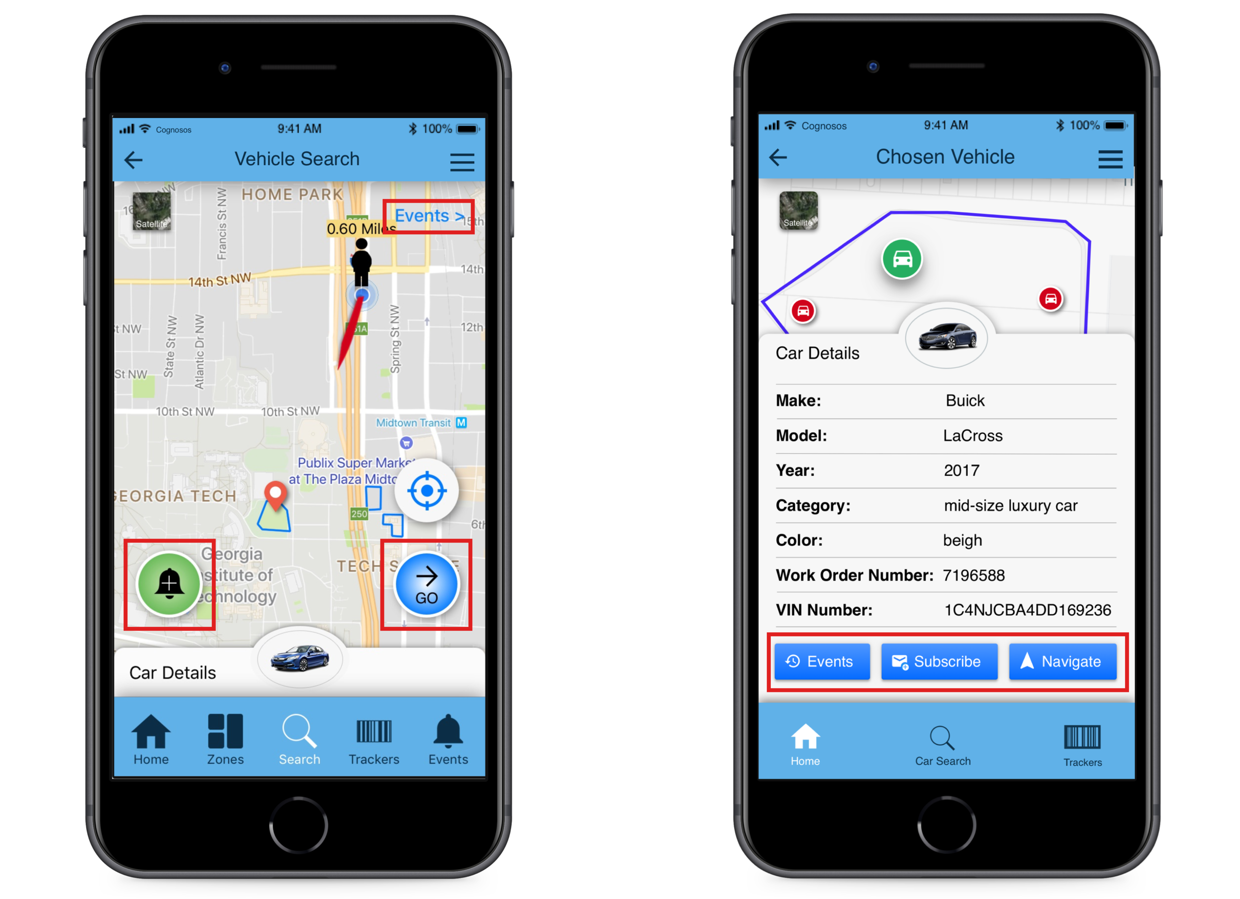
· Navigate, Subscribe, and Events buttons in RadioTrax before (left) and after (right) the usability test
Optimize the main functionalities:
Following the usability test, we decided to remove unnecessary functionalities from the mobile application, and to enhance its main functionalities:
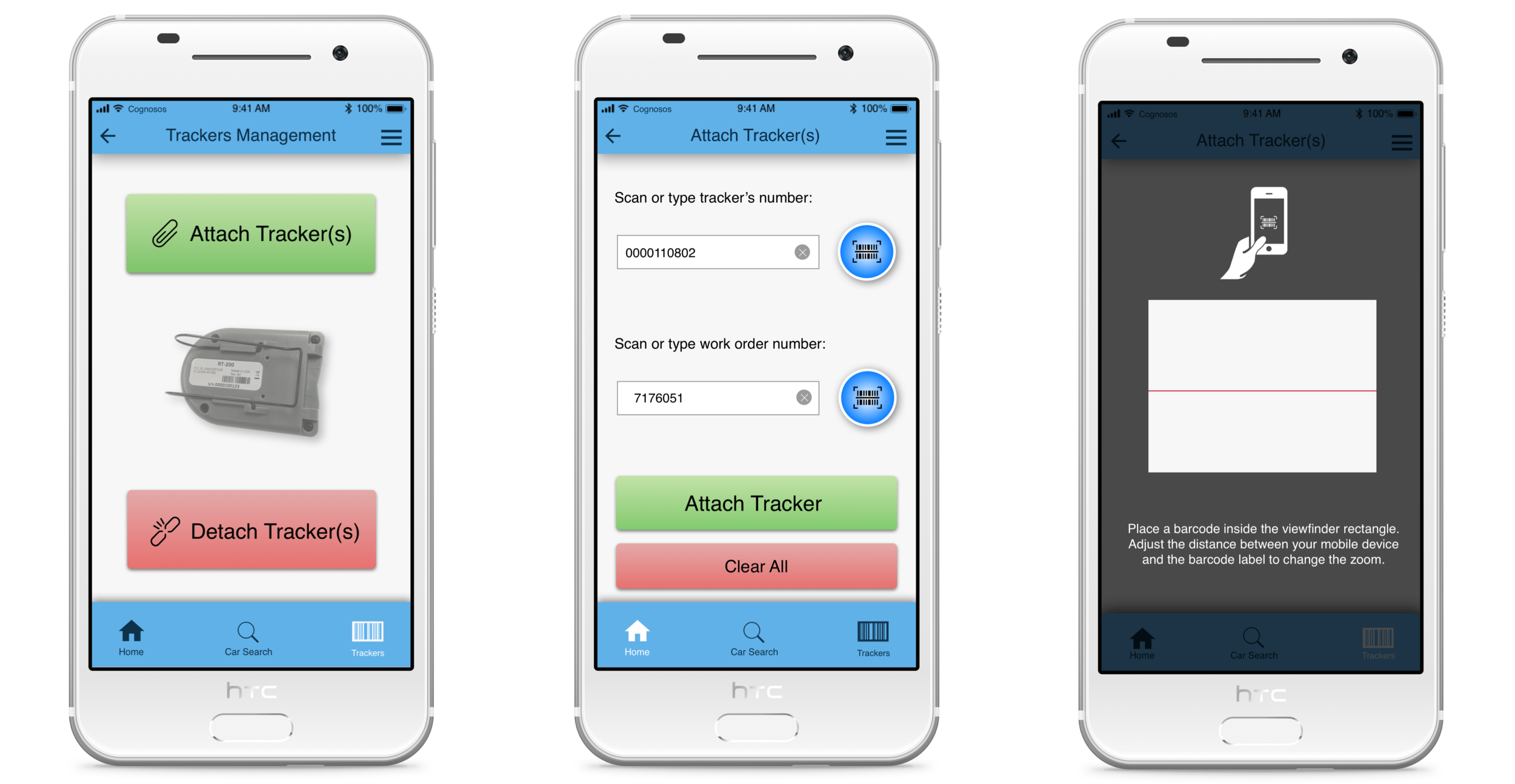
Attachment of trackers to assets - providing the necessary feedback without requiring unnecessary actions from the user. In other words, adding snackbars for successful attach / detach operations, and leaving pop-ups only for error messages.
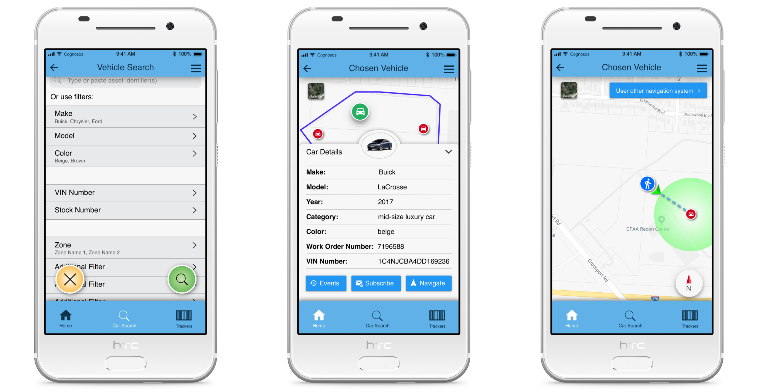
Searching - adding an option to search an asset not just by its unique ID, but also by other asset identifiers, which aren’t necessarily unique.
Navigation - improving the navigation experience by adding a line from the user to the asset of his interest. By aligning the direction arrow, the user should be able to identify the correct walking direction.
High Fidelity Prototyping
Following the above research and decisions, I created a high fidelity prototype based on Material Design guidelines that were modified to fit unique user needs.
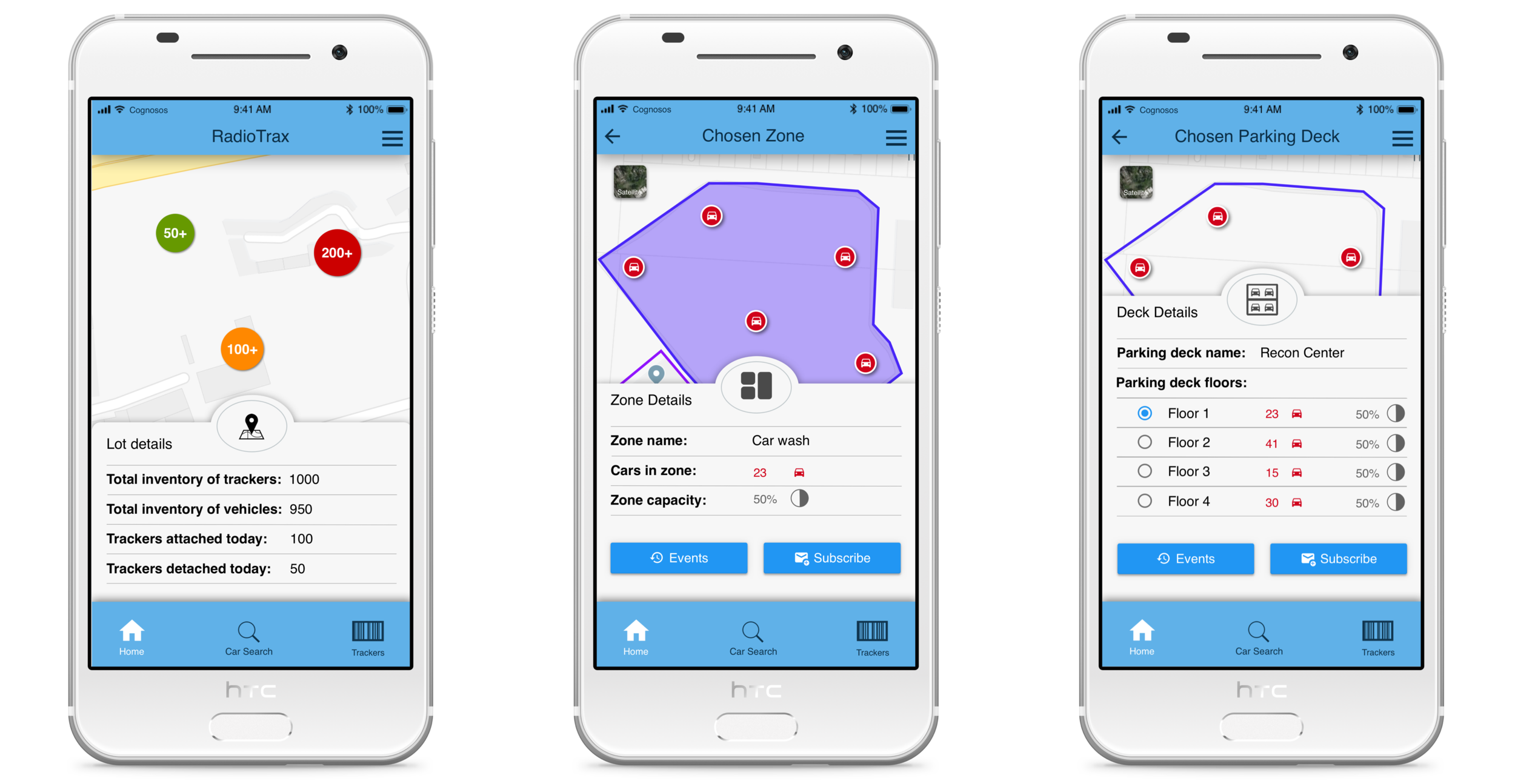
Overall, 167 high fidelity screens were designed.
Product Adoption and Modification
After releasing version 2.0 of RadioTrax for Android, a few users reached out to us and shared that on some screens the actions were less accessible than in the previous version.
To discover their frustration source, we conducted user interviews and found out that the search icon wasn’t discoverable enough and thus some users couldn’t find the assets in which they were interested.
In the old Android application, the users could reach the search button directly from the Home screen, while in the new version, because of the introduction of filters and copy-paste functionalities, the search button was less accessible (see below):
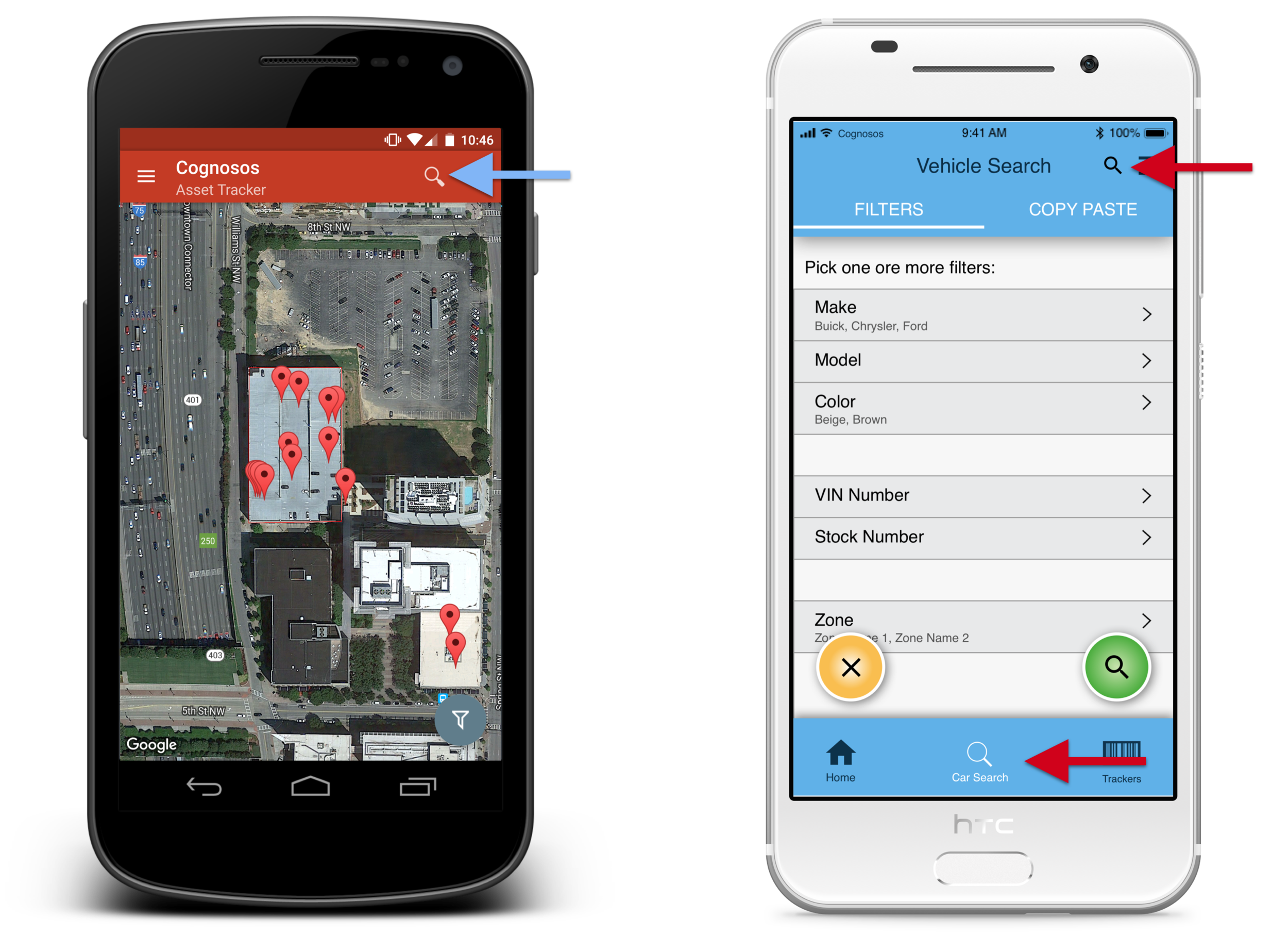
Search icon in RadioTrax v.1.0 (on the left) and in RadioTrax v.2.0 (on the right)
To overcome the above challenge and minimize the number of interactions, we redesigned the above interaction and deployed an enhanced version.

· Search button in RadioTrax v.2.0 before (left) and after (right) the enhancement
Final Result
Outcomes
Reducing support and marketing efforts - releasing an Android application, which had a similar look & feel and information architecture across platforms, significantly reduced the effort of marketing and training materials production.
Enabling design and development progress - before redesigning RadioTrax 2.0 on Android, we couldn’t add new features to the product because adding new features to an old application wasn’t an option, and adding features on the iOS and the web-portal alone wouldn’t allow their usage by half of our customers. After releasing the new version, we were able to add new features.
Optimization and user experience improvements - based on active user analysis (see below) and feedback from the field, the application was successfully adopted and improved the customer experience: our users could search assets in a greater number of ways, attach them faster, and navigate to them more intuitively.

· Active user analysis for RadioTrax on Android v.2.0 (source: Firebase)
What did I learn?
Design is an art of tradeoffs - each design decision taken will influence not just the user experience, but also the development, the QA, the marketing, and the training costs. As designers we tend to strive for perfection in every component and every interaction, and yet what matters in the end is not what was designed, but what was released to the customer. Therefore, the best product designer will not only try to create the best experience, but will also take into account all the complexities and costs, and come up with the optimal solution.
Be careful when modifying an existing product - when introducing a change to an existing product, one should be extremely careful since users are already used to the existing structure and interactions of the application. Therefore, every existing flow must be more intuitive and simpler than before. Otherwise, customer satisfaction will go down quickly.
Testimonials

“… Felix continues to go the extra mile in making Cognosos’ products best in class. Not only is he doing top quality UX design, but he has also been very industrious in driving project management, especially given the minimal resources …” (performance review 2019, learn more)

“… Since starting to use Cognosos’ product, at least nine fewer personnel are needed to scan the yard full time … There is a measurable improvement in efficiency because I’m receiving real-time location updates for 100% of my inventory, 24 hours per day, 365 days a year …” (read more).