
RadioTrax - Web Portal
Project Description:
RadioTrax for the automotive industry
After landing a $7 million investment from Cox, releasing RadioTrax on iOS, doubling its workforce, and expanding sales, Cognosos’ management decided to redesign their existing RadioTrax web-portal, and I was appointed to design a more modern and user friendly system, and lead its production.
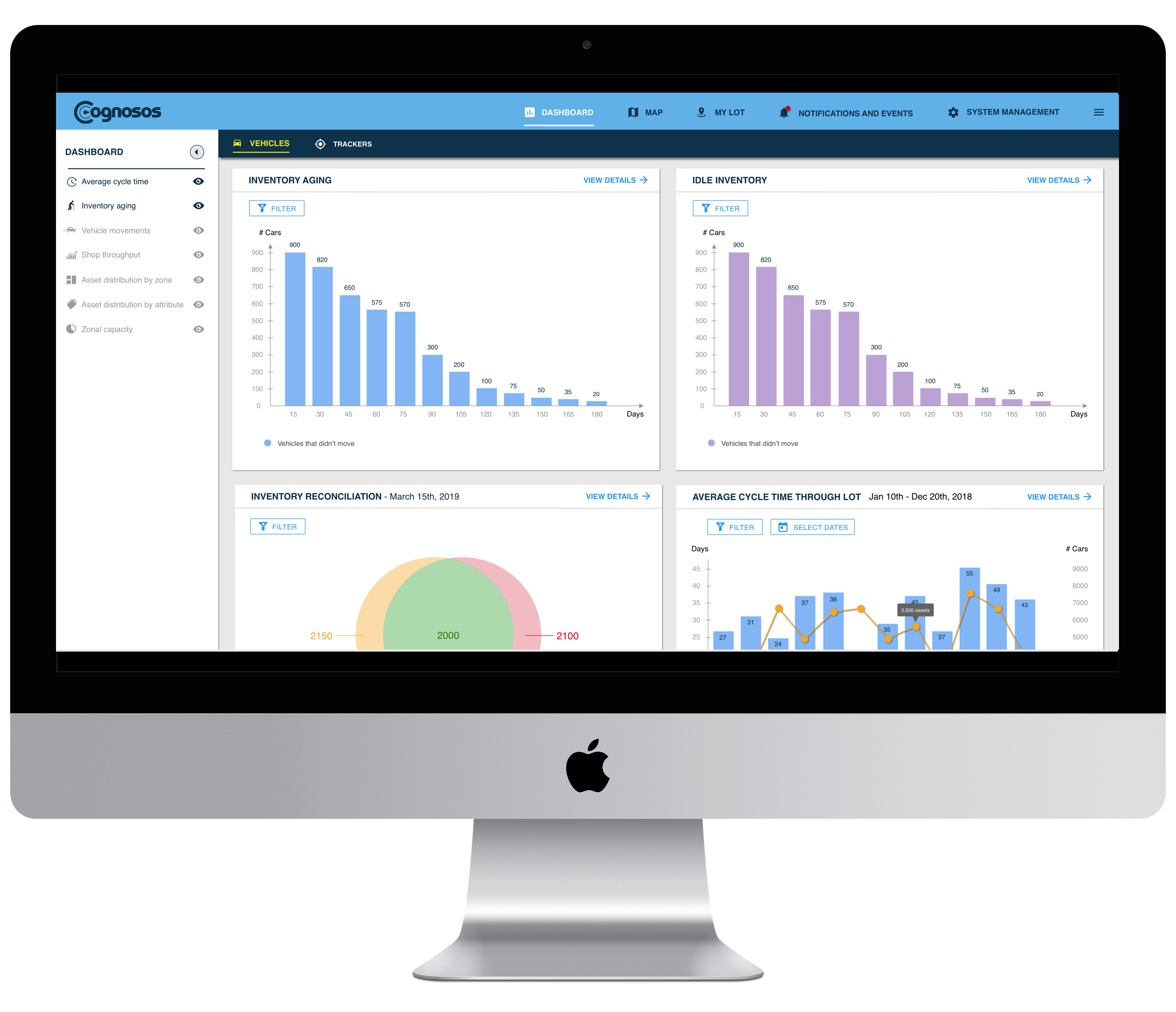
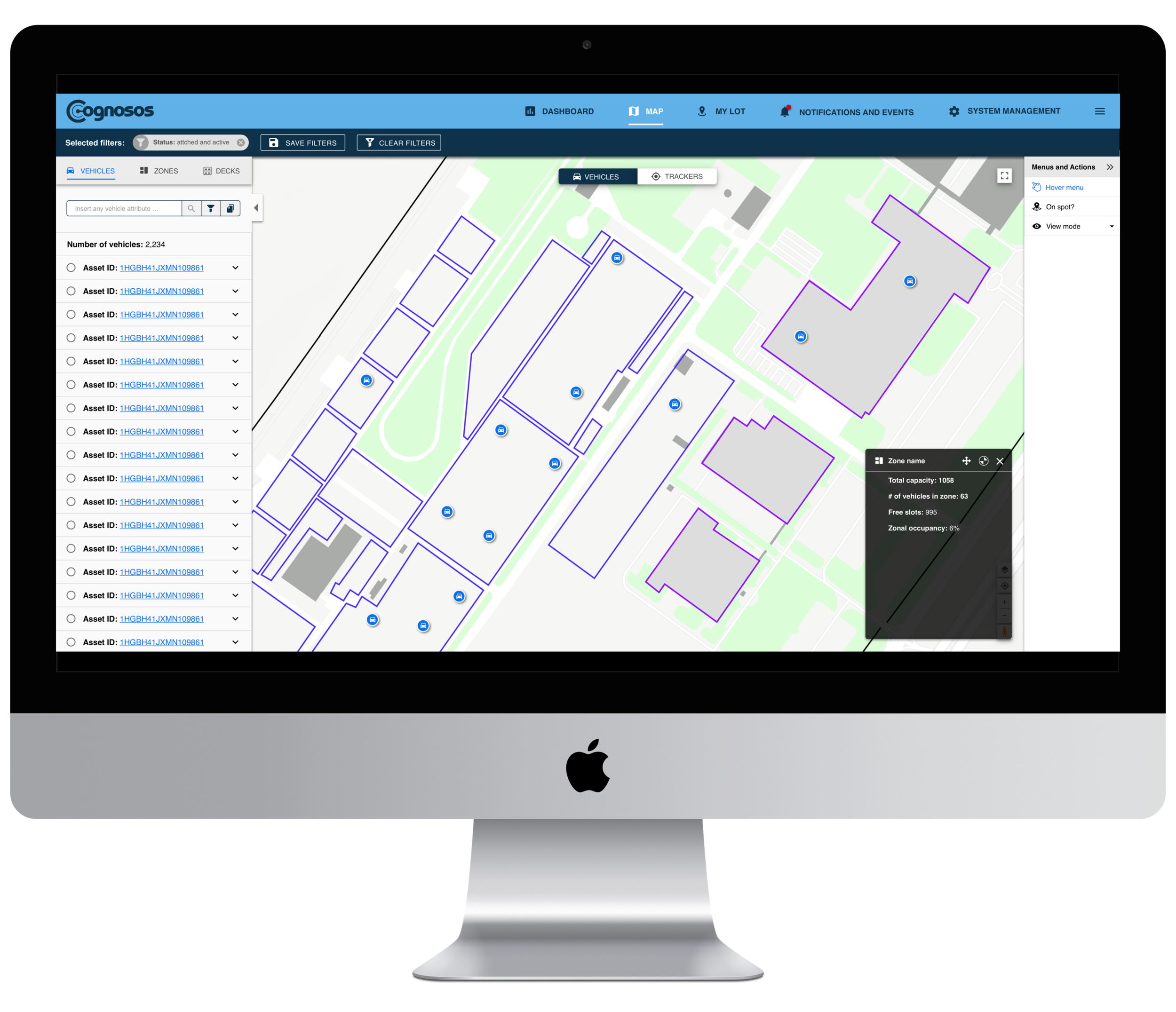
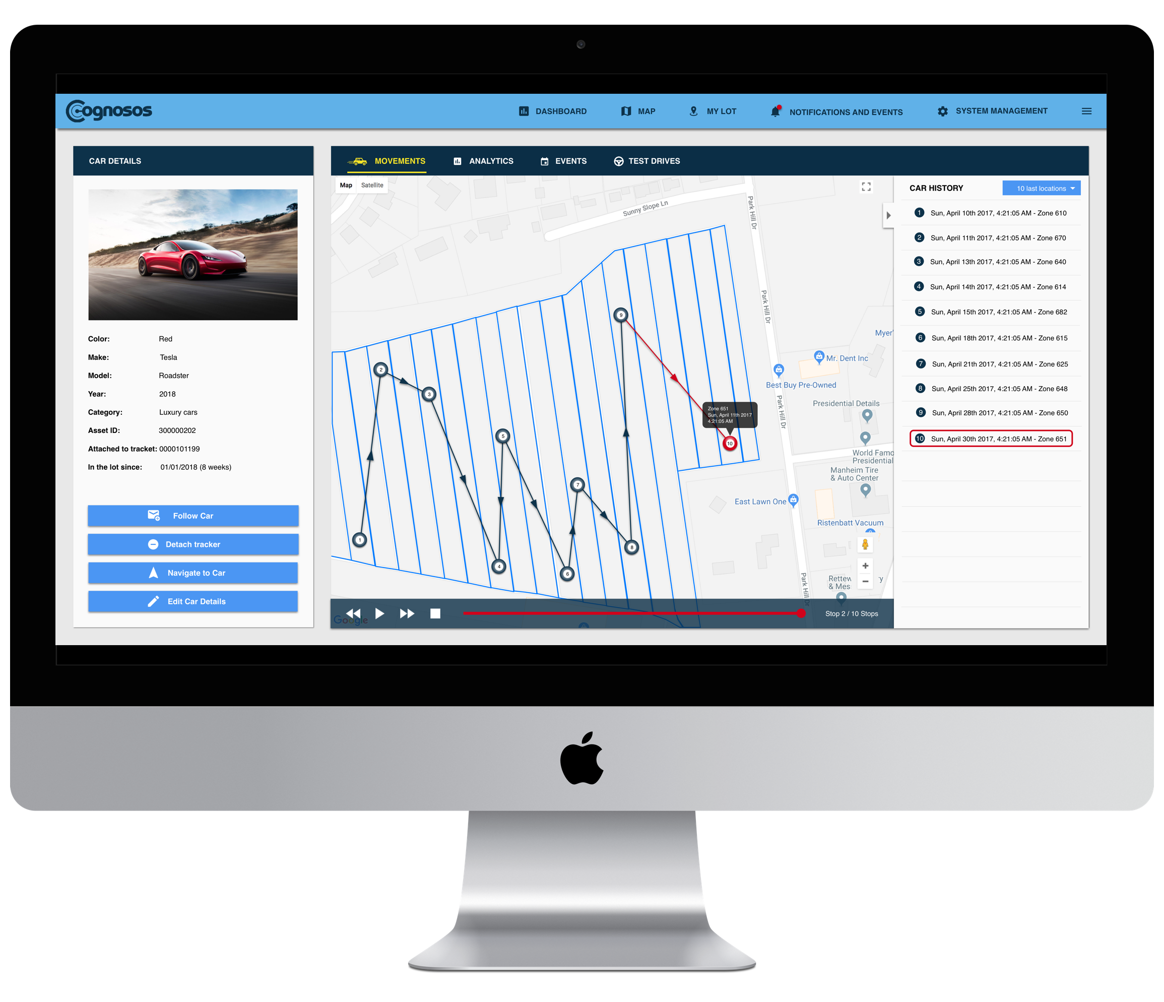
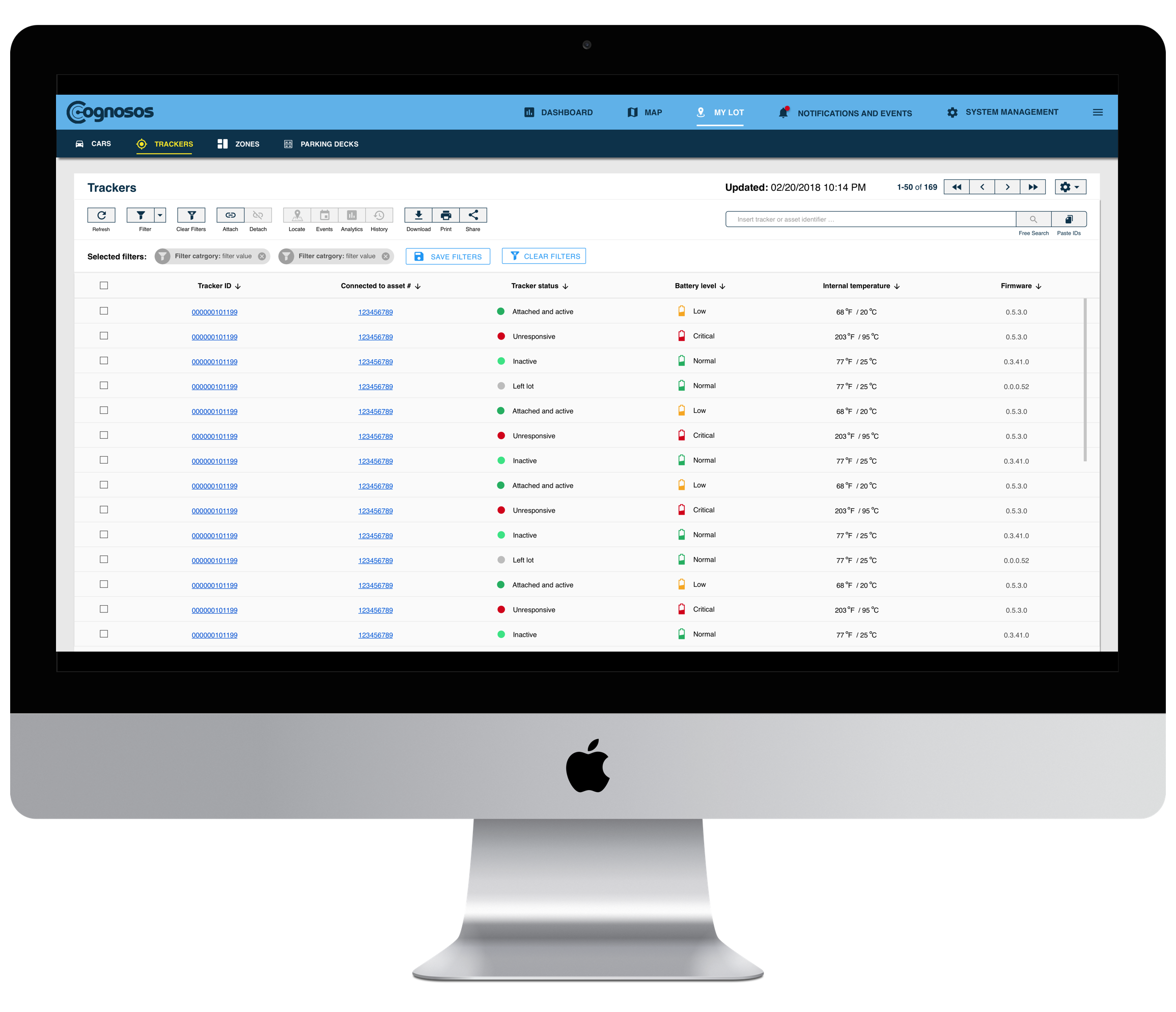
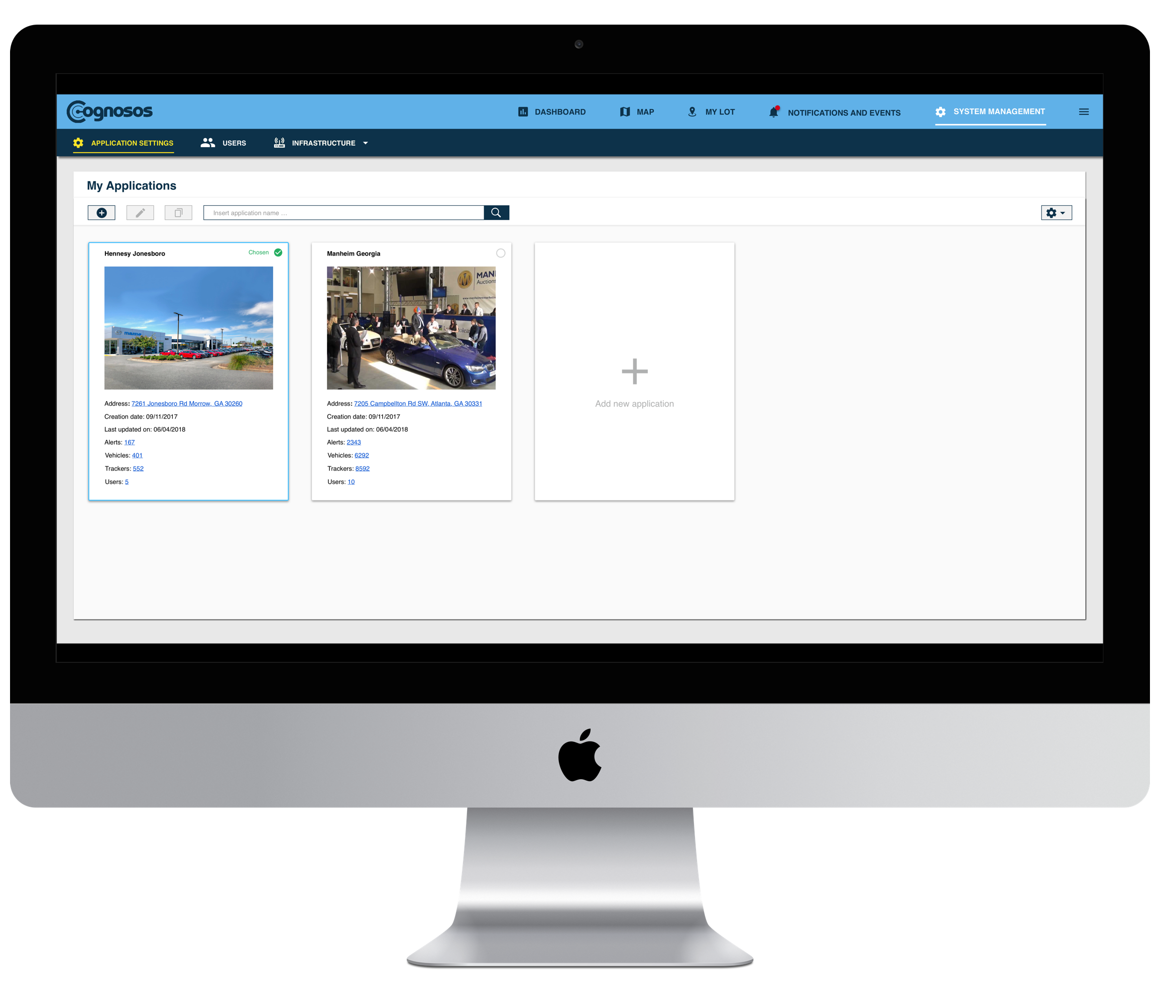
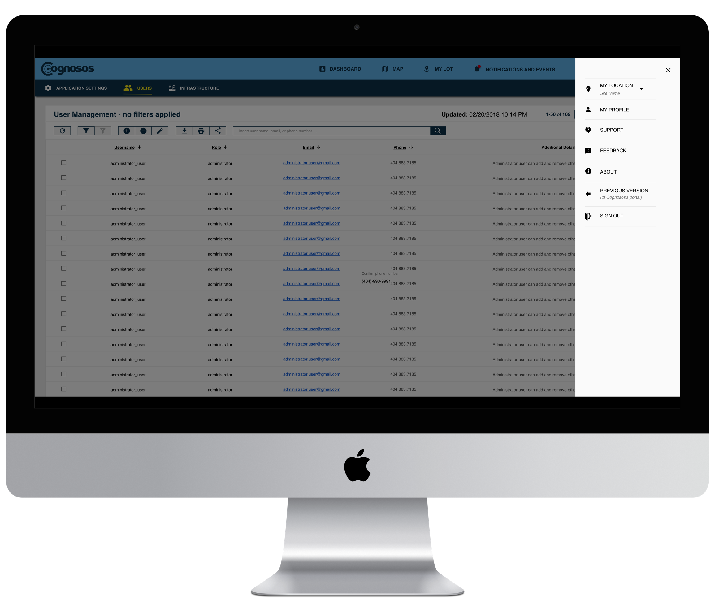
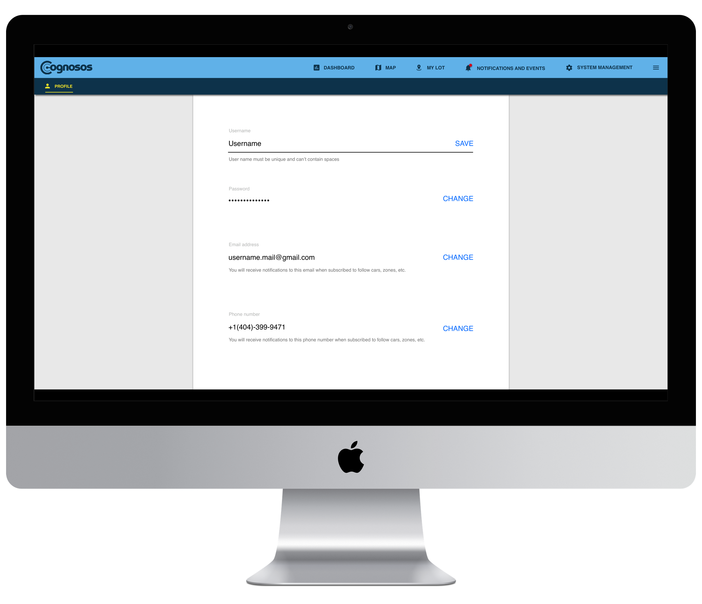
While the iOS and the Android applications were mostly designed for field employees, whose main tasks revolved around asset localization and movement, the web-portal is a much more complex system, used by a range of different stakeholders at customer sites. In addition to provisioning and localization of assets, the web-portal also provides the user with advanced analytics, system management, reports production, and tracking historical data capabilities.
Since we already had a working web-portal, which was used by hundreds of users on a daily basis, our main challenge was to release a new version of the product very quickly and with only one frontend developer, without diminishing existing functionality.
Design Process
Heuristic Evaluation
After understanding the underlying technology, I performed a heuristic evaluation of the existing web-portal:
My major takeaways from the process described below:
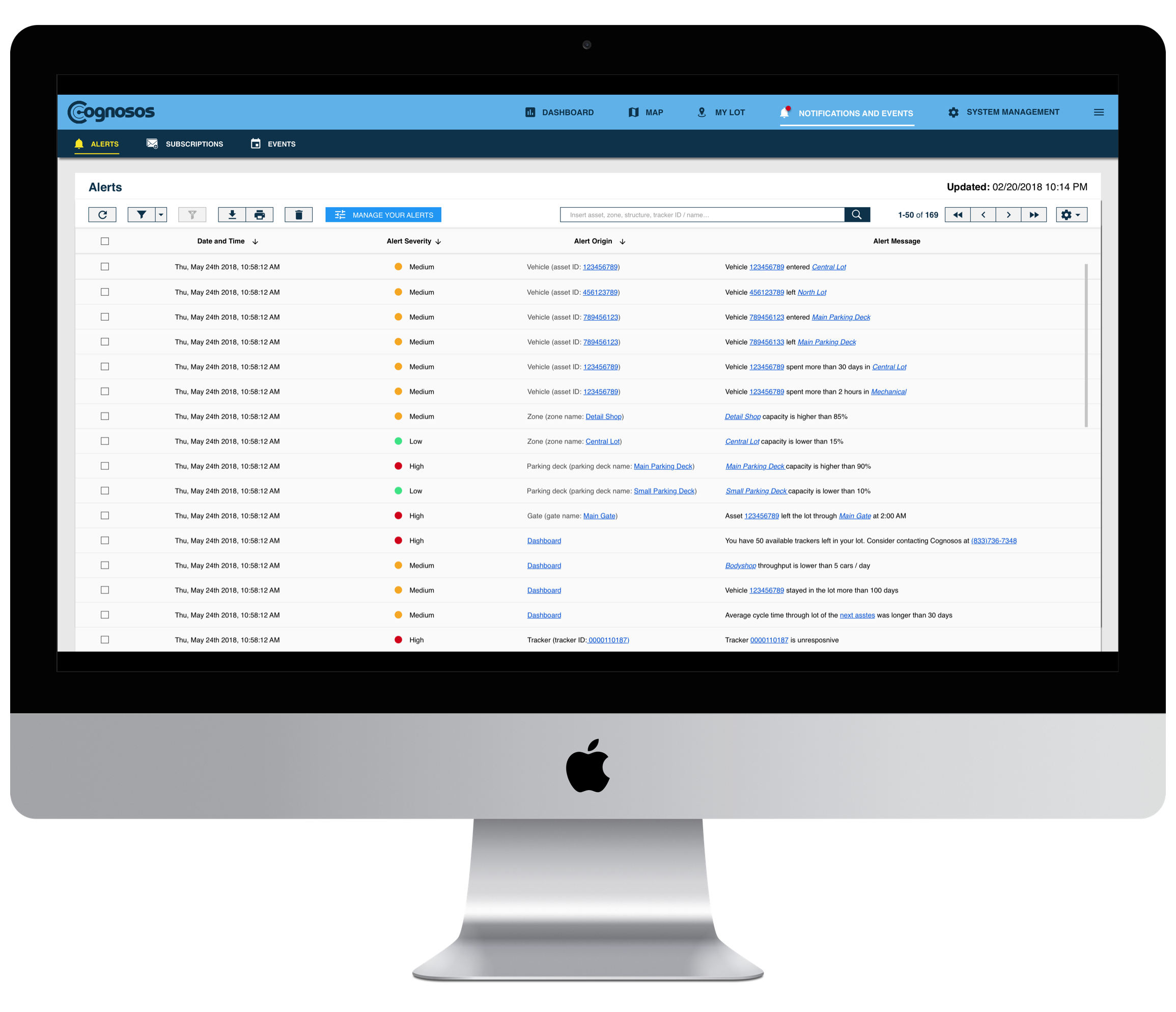
Problematic micro-interactions on the Map screen - rendering thousands of assets on a map-based screen resulted in significant system delays. The solutions, which were chosen to resolve these challenges, resulted in unnecessary interactions and visual noise.
Lack of clear information architecture - the relationships between various sections and functions of the interface weren’t visually clear. In addition, it was difficult to associate between entities and actions that could be applied to them, because they weren’t placed in visual proximity to each other.
Overly complex information visualization - the few presented graphs showed the aggregated data precisely, but were missing the most important characteristic of information visualization - simplicity and readability.
Undiscoverable features - many important features of the system were hidden in secondary menus or represented in an unclear way, which made it difficult to discover them.
Lack of responsiveness - the web portal was built for a certain screen size, and wasn’t responsive to screen size changes.
Outdated look & feel
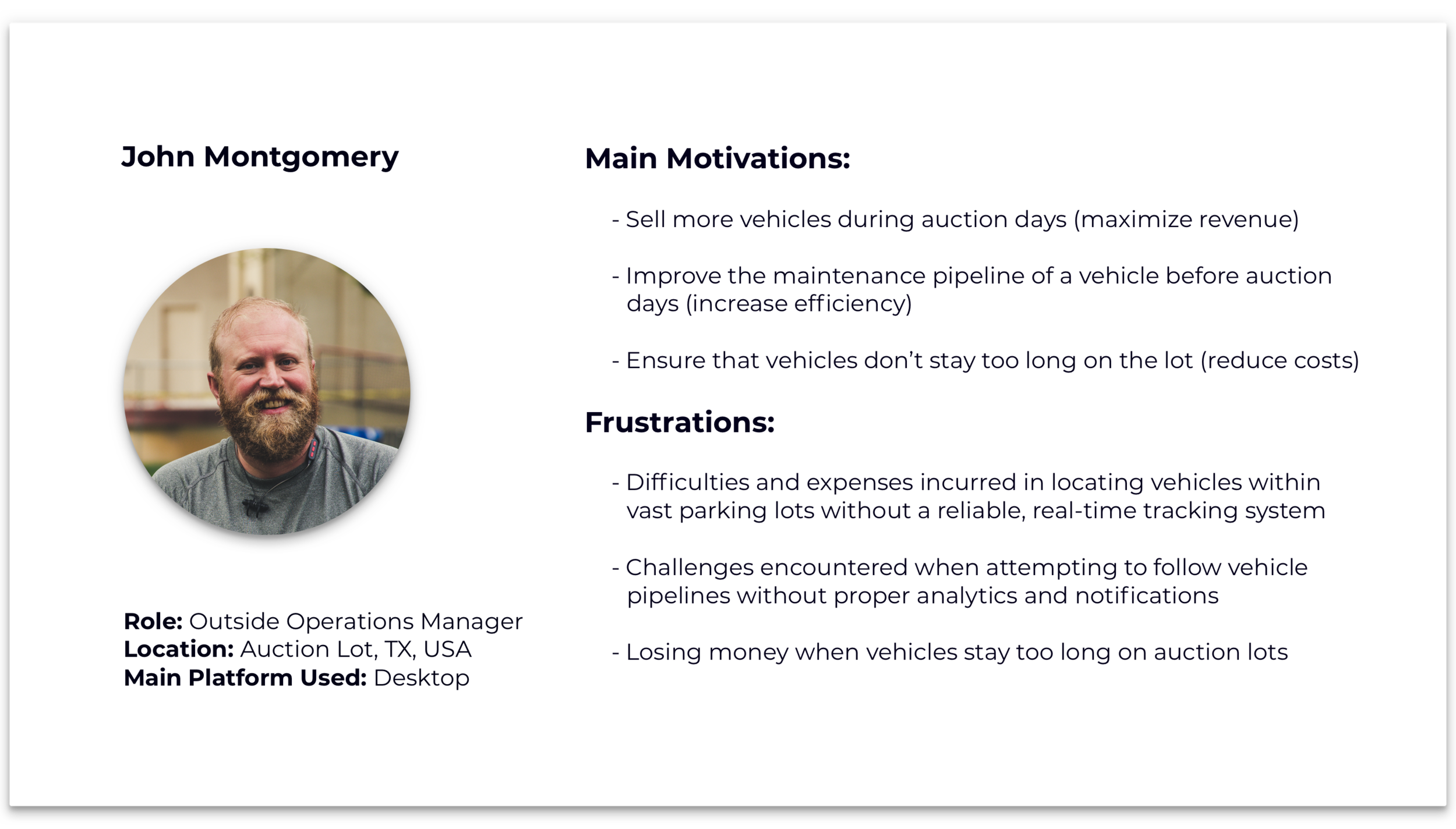
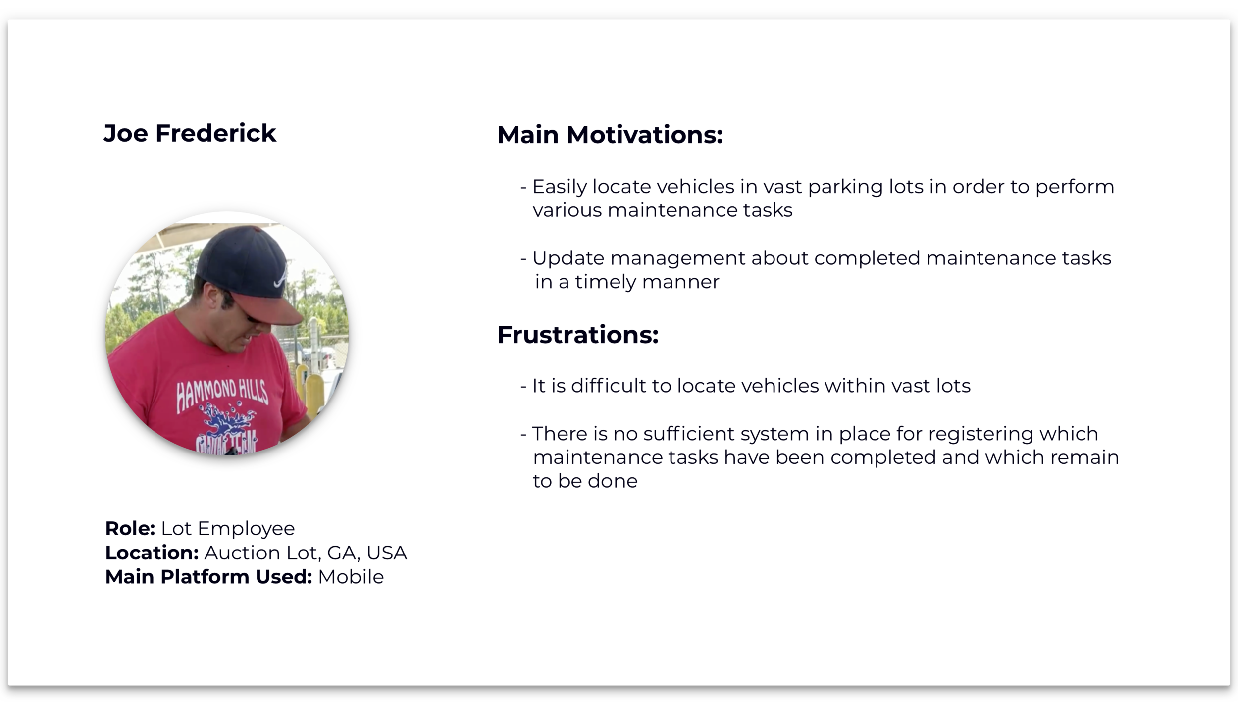
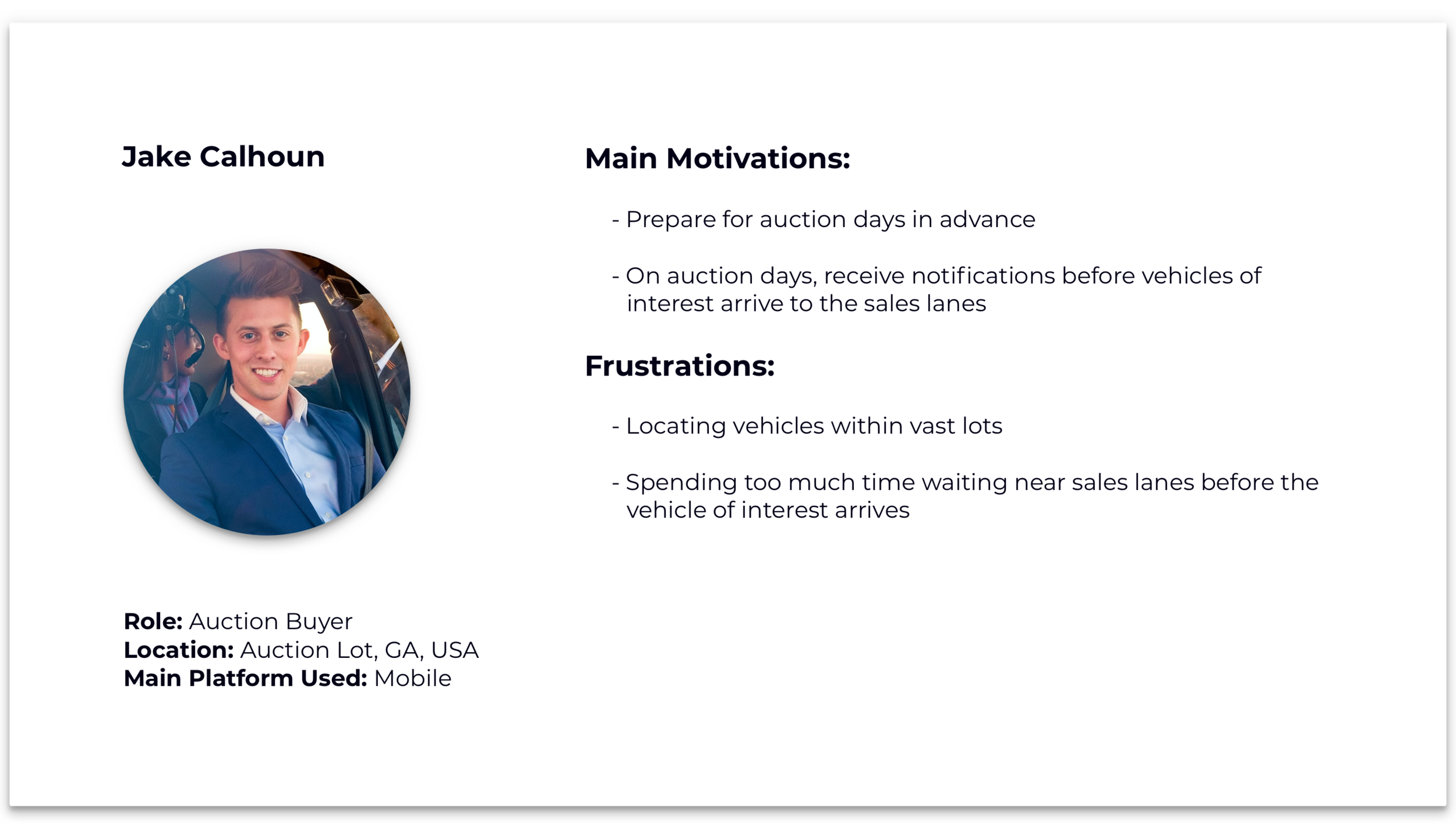
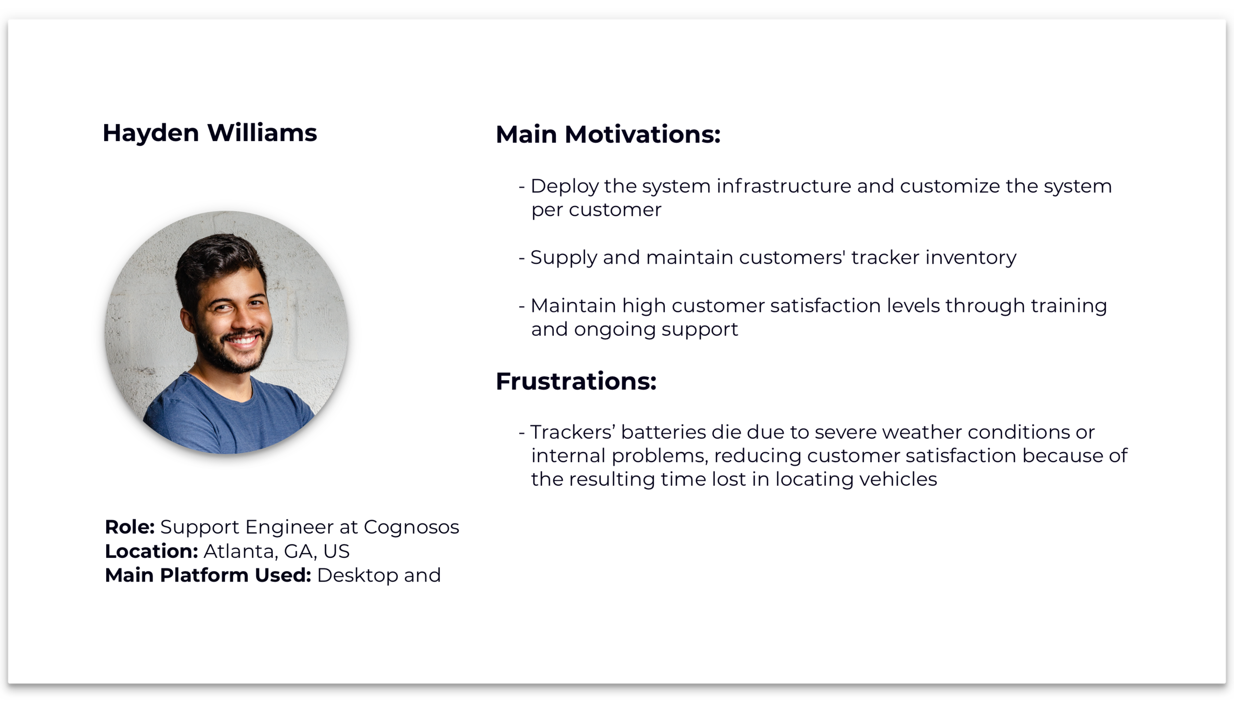
Contextual Inquiries and Persona Profiling
When I was designing the iOS application, we had just two customers and therefore performing proper user research was a real challenge. During the web-portal design process, we had more customers, and I had the opportunity to conduct three contextual inquiries with general managers of two action lots and a VPC. In addition, I used these visits to perform several guerilla interviews with lot employees.
Visiting an auction lot in South Georgia
Following these visits, as well as extensive interviews with our support, sales, and management teams, I defined four main Personas of our system and identified the main motivations and frustrations for each of them:
Low Fidelity Prototyping
After discovering usability issues in the existing web-portal, focusing on the users of the system, and gathering new requirements, I started to work on a new version of the product. To move fast, fail early, avoid attachment to my own designs, and gain maximum freedom, I chose to work with pencils, paper, and InVision.

Low fidelity prototype for the On Spot feature in RadioTrax web-portal
High Fidelity Prototyping
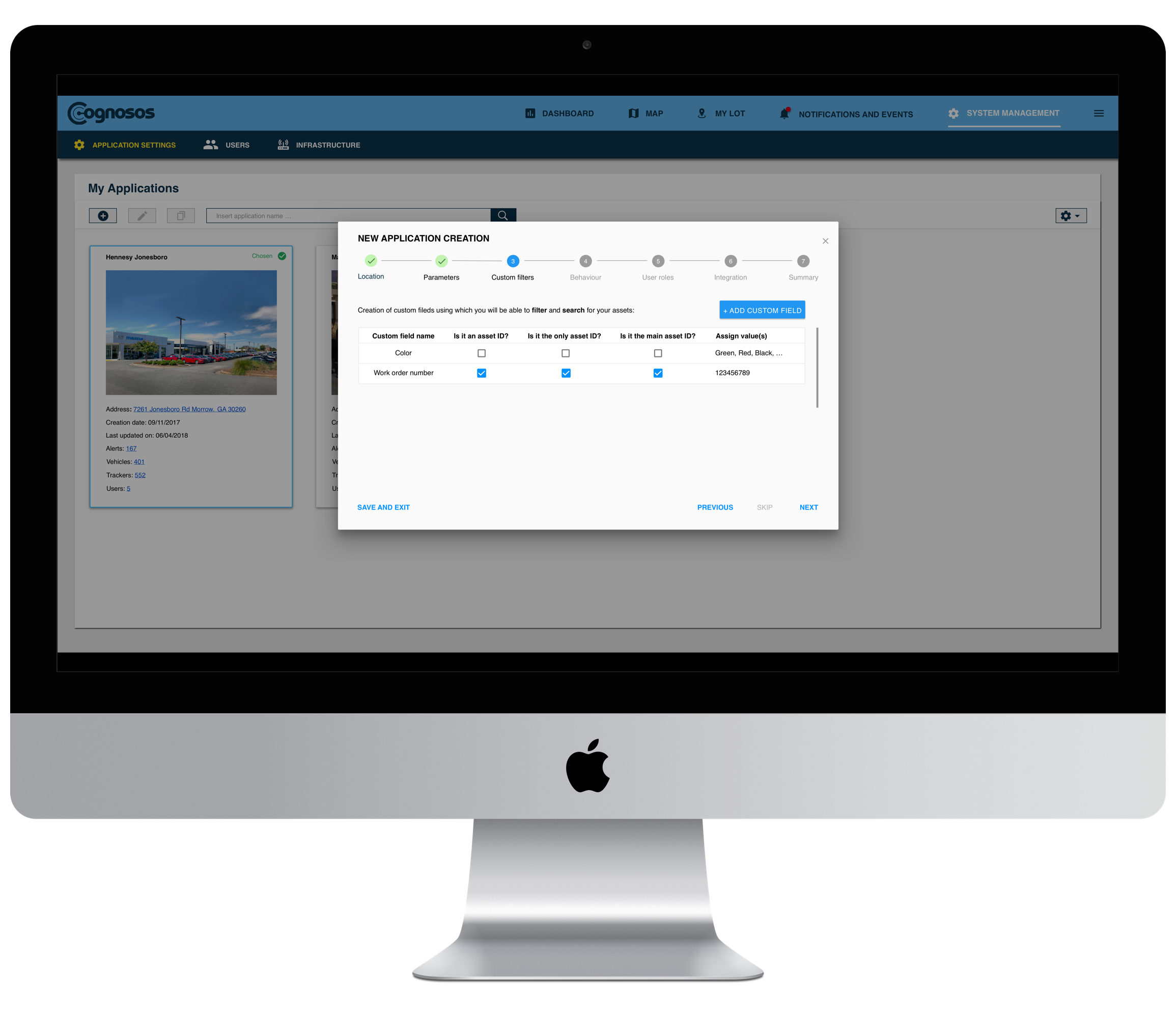
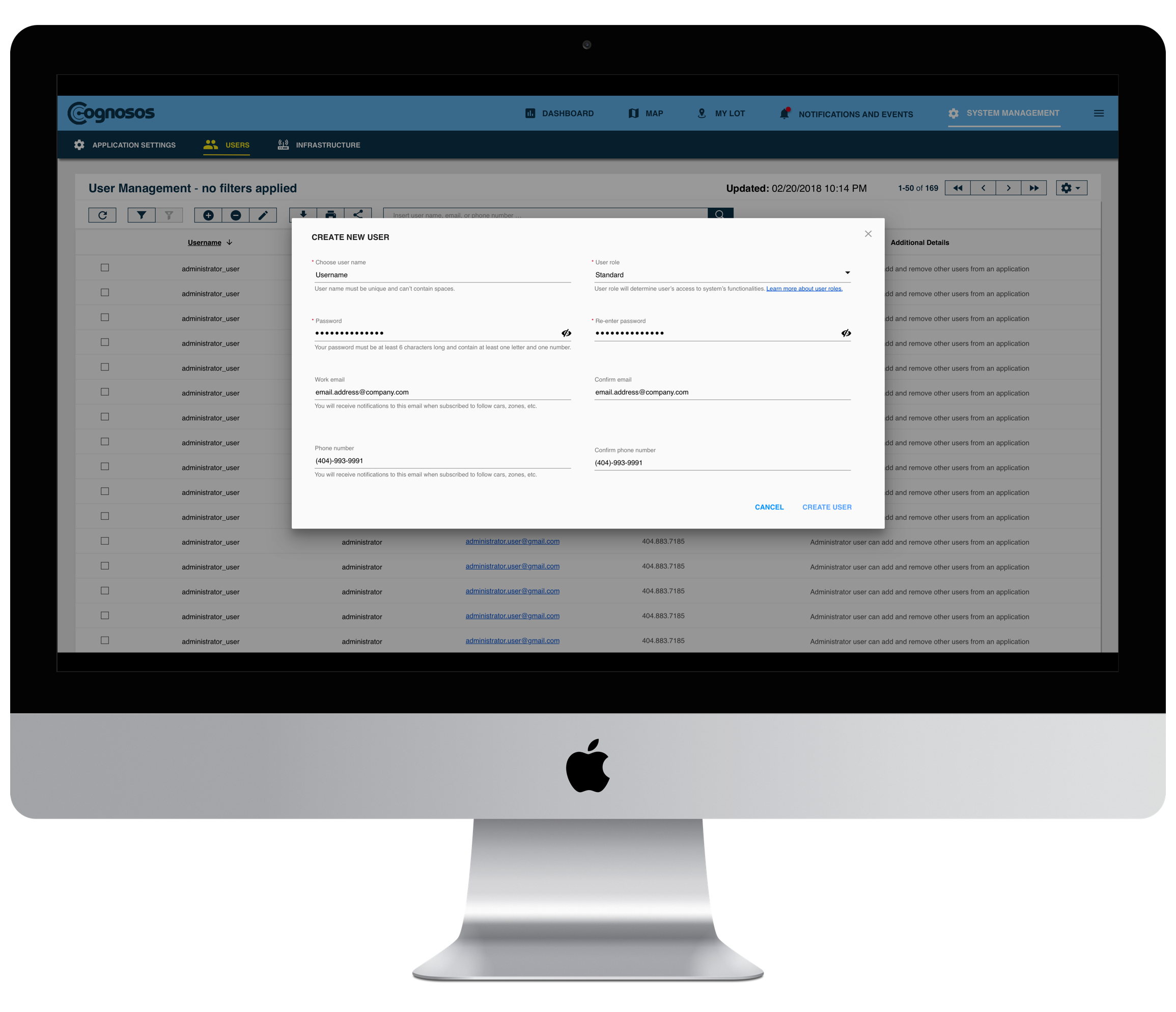
To discover design gaps, define the look & feel, drill down into interaction design, and provide exact specifications to the development team, I created a pixel-perfect high fidelity interactive prototype that consisted of 353 screens.
The prototype was built according to Material Design guidelines and following Ben Shneiderman’s Eight Golden Rules of Interface Design and Jakob Nielsen's 10 General Principles for Interaction Design.
One of the most challenging and interesting parts of the design was the application’s Dashboard. To answer questions like “Should we apply a global or a local filter?” or “What is the range we should show?”, I conducted extensive discussions with Prof. John Stasko and Prof. Carl DiSalvo from Georgia Tech, who are renowned for their expertise in data visualization. In addition, I studied dashboards from other systems with complex data visualizations, such as Firebase, Google Analytics, and App Analytics in App Store Connect. The ultimate goal was to create very simple graphs that could be understood at a glance and with minimum interactions
Final Result
Outcomes
Increase in sales and expansion of the user base - along with the new iOS application, the new web-portal allowed Cognosos to increase its sales and subsequently grow its user base. Before the release of portal 2.0, we had 250 active users within 28 days. Five months after, we had 350 active users within 28 days - an increase of 140% in five months!
Successful product adoption - after releasing RadioTrax web-portal 2.0, we still enabled our users to use the previous version of the system. However, from the graph below it can be clearly seen that our users preferred the new version, and over time completely stopped using the older version.
What did I learn?
Agile isn’t a panacea for every situation - one of the main principles in Agile methodology is the fact that big features can be broken into smaller chunks of work and delivered to the customers gradually. However, in our case, we couldn’t release a product that didn’t have all the features that its predecessor had. In addition, we wanted to add new functionalities to the product before the release. Therefore, the Agile methodology couldn’t be applied, except internally. In addition, when designing a new system from scratch, one should first see it as a whole. Diving into a system’s individual components without establishing the overall information architecture may potentially lead to unnecessary work in the future.
Low fidelity prototyping requires the right tools - low fidelity prototyping has many advantages, such as quick ideation and lack of attachment to suggested designs. However, creating low fidelity prototypes using pen and paper is very laborious. At the same time, tools like Balsamiq are problematic since they enforce the designer to use a given set of UI components. This project prompted me to seek new solutions and I found reMarkable, a tool that enables the designer to draw interfaces freely and, at the same time, replicate needed components via copy-paste.
Testimonials


“ … Felix has a tremendous, positive, can-do attitude, and is always ready to contribute in any way he can. In particular, Felix wore quite a few hats in getting applications from basic user stories to finished, tested product … That connection between the development cycle and real customers, along with the high standards for released product, consistently led to very high satisfaction levels across our diverse customer base ...” (read more).
“ … One of the challenges in running an auto auction is finding cars, and what Cognosos has done is taken this effort down to minimal work. People are able to look at their phone and walk to their car … We are all looking to become more efficient and when you can walk right to the car, it’s more efficient … ” (view more).